Showing posts with label science. Show all posts

Friday, January 29, 2016

2015 Climate Summary of the Southeastern United States


Highlights

Following a record warm December, 2015 wrapped up with more abnormal climatic conditions. Nearly every state in the Southeast experienced much above normal temperature conditions (Fig. 1) and above average precipitation totals (Fig. 2). Florida, however, was around the precipitation average. Additionally, there were some significant climate anomalies throughout the year. A strong El Nino formed across the equatorial Pacific and peaked towards the end of the year. The North Atlantic hurricane season was slightly below average with 11 named storms, 4 hurricanes, and 2 major hurricanes. In October, Hurricane Joaquin interacted with an upper level low, which lead to historic rainfall amounts across the Carolinas. Around Charleston, South Carolina rainfall amounts were around 15-20 inches with isolated amounts of up to 25 inches. Severe weather swept across the south in late December, which caused tornadoes and record flooding. Lastly, Florida has its warmest year on record with an average statewide temperature of 3.3°F above normal.
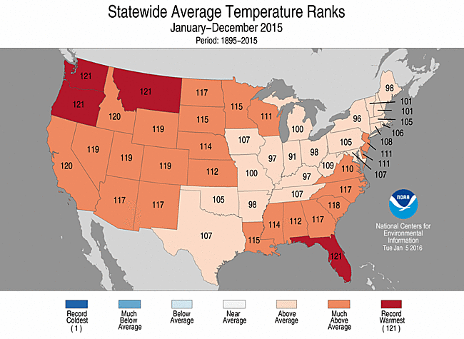
Figure 1. Statewide average temperature ranks for January - December of 2015, Source: NOAA/NCEI
Figure 2. Statewide precipitation ranks for January - December of 2015, Source: NOAA/NCEI

Seasonal Analysis 

A prominent trough remained over much of the Southeast during the winter months. Consequently, most of the states experienced a below average winter, while Florida, Georgia, and South Carolina were around normal. Most of the lower Mississippi Valley experienced drier than normal conditions while the other Southeastern states were around normal precipitation totals for remainder of the winter season. 

By spring, the pattern shifted as most of the Southeast experienced above average temperatures and Florida set a new spring temperature record (4.6°F above average). Nighttime temperatures were much above normal, which allowed the average temperature to exceed above normal conditions. As for precipitation amounts, the southeast experienced a mix of climatic anomalies by the end of May. The lower Mississippi Valley had above normal precipitation amounts while Florida, North Carolina, and South Carolina experienced drier than normal conditions. The remaining Southeastern states were around their normal precipitation totals. Additionally, Tropical Storm Ana made landfall on May 10th near Myrtle Beach, South Carolina. Little damage was reported, but heavy rain fell across the Carolinas. 

Florida, Louisiana, North Carolina, and South Carolina experienced much above normal temperature conditions by the end of the summer. Kentucky and Tennessee remained around average temperatures by August while the rest of the Southeastern states were warmer than average. Below-average precipitation fell across the Southeast. Combined with warm temperatures, drought conditions worsened across the lower Mississippi Valley and Southeast. In contrast, above-average precipitation fell across Kentucky, Tennessee, and Virginia. In August, remnants of Tropical Storm Erika moved across Florida, which helped alleviate drought conditions. 

Every Southeastern state had an above-average fall temperature. Florida had its warmest fall on record with the statewide average around 3.6°F above the norm. As for precipitation, every state (except Florida) had above-average precipitation amounts by the end of fall. The historic flooding event in early October caused South Carolina to have its wettest fall on record with 23.76 inches (13.91 inches above average). Due to the rainfall, drought conditions improved across the entire Southeast.

Atlantic Hurricane Season 

Figure 3. 2015 Atlantic hurricane season with storm tracks and strength, source: NOAA National Hurricane Center
The 2015 Atlantic hurricane season had 11 named storms, 4 hurricanes, and 2 major hurricanes (Fig. 3). The season was slightly below the climatological mean. On average, 12.1 named storms occur with an average of 6.4 hurricanes and 2.7 major hurricanes. The lack of activity could be due to the El Nino, which tends to suppress Atlantic hurricane activity.

Two tropical storms made landfall (Ana and Bill) and no hurricane or major hurricane made landfall this season. Hurricane Joaquin did not make landfall; however, it did interact with an upper level low, which caused historic flooding in the Carolinas. This season continued the record-long streak of no major hurricane (category 3 and higher) making landfall. On average, a major hurricane makes landfall every 3 years. The last major hurricane to make landfall was Hurricane Wilma, which was November 24, 2005. 

Severe Weather Season

Figure 4. 2015 tornado occurrences in the United States, Source: NOAA Storm Prediction Center

For the United States, the preliminary report of tornadoes was around 1, 183. This season was below the climatological average, which is 1, 253 annually. Most months were around the climatological mean for tornado reports. However, May, November, and December were well above their respective averages. In May, there were 414 confirmed tornado reports, which is 138 above the average. In November, there were approximately 95 preliminary reports, which is 37 above the average. In December, there were 86 preliminary reports, which is 62 above average. Lastly, in the Southeastern U.S., there were no tornado reports, which was the first time that at least 1 tornado was not reported in the region. 

Reference: 

NOAA National Centers for Environmental Information, State of the Climate: National Overview for Annual 2015, published online January 2016, retrieved on January 28, 2016 from http://www.ncdc.noaa.gov/sotc/national/201513

Wednesday, January 13, 2016

Southeast Climate at a Glance - December 2015

Following a mild November, December 2015 was also warm and wet across the region. The entire Southeast experienced above average temperatures and precipitation totals during December. In fact, many states set new temperature records. Specifically, nine states set December records for their statewide average temperature, maximum temperature, and minimum temperature.

Temperature Summary 

December temperatures were much above average with some locations reaching the 70s and 80s. Many weather stations observed record-breaking temperatures throughout the month. Virginia, Kentucky, Tennessee, North Carolina, South Carolina, Georgia, Florida, Alabama, and Mississippi experienced their hottest December on record (Fig. 1). Most of the region was 9 to 14 degrees F above their mean temperature norm, while southern Florida was 6 to 9 degrees F above their mean. The warmest part of December was the 24th through the 27th as maximum temperatures reached the 70s and minimum temperatures remained in the 60s. The coolest part of the month was the 19th and 20th as minimum temperatures fell below 30 degrees F over most of the Southeast. 
Figure 1. Statewide average temperature ranks for the month of December. Source: NOAA/NCEI

Precipitation Summary

Most of the region observed above average precipitation totals by the end of December. In total, eight states (Virginia, Kentucky, North Carolina, South Carolina, Georgia, Alabama, and Arkansas) observed well above average precipitation totals (Fig. 2). Stations in Alabama, Georgia (except the southeastern quadrant), northern South Carolina, North Carolina, south-central Virginia, the Florida Panhandle, and southern Florida recorded precipitation totals 200 to 600 percent of normal. Stations across central and northern Florida and southeastern Georgia recorded precipitation totals 5 to 50 percent of normal. 
Figure 2. Statewide precipitation ranks for the month of December. Source: NOAA/NCEI

Drought and Climate Impacts on Agriculture

There were no drought conditions (class D1 or greater) present during December. 
There were some damaged agriculture reports across the region. Heavy rainfall events caused flooding over southeastern Florida and damaged winter yellow squash, zucchini, and green beans. In Georgia, farmers were unable to harvest a significant amount of their pecan groves due to saturation. Lastly, lack of cold temperatures (specifically between 32 and 45 degrees F) in Georgia reduced the necessary winter dormancy for peach trees and blueberry bushes. This will likely negatively affect the yield in 2016.  

In Summary

A couple contributing factors to the abnormal December climate is the El Nino and Arctic Oscillation. El Nino tends to enhance the subtropical jet stream, which directs storm tracks along the southern states. An El Nino normally causes above normal precipitation totals across the southern states during the winter months. In regards to the temperature, the Arctic Oscillation was positive for the majority of December. This means that the Arctic air is trapped in the polar region. Consequently, arctic air masses remained north while southerly flow directed warm air in the region causing above normal temperature conditions. 

NOAA National Centers for Environmental Information, State of the Climate: National Overview for December 2015, published online January 2016, retrieved on January 13, 2016 from http://www.ncdc.noaa.gov/sotc/national/201512.


Friday, January 8, 2016

Raleigh December Climate Summary

Winter in the southeastern United States is usually mild, but this past December was far from normal. December 2015 ranked as the hottest December on record average maximum, mean, and average minimum temperature for the Raleigh weather station. Across the entire state, almost every station recorded its warmest December on record for mean temperature and a few others recorded their second warmest. Along with warm temperatures, total precipitation was about 3 inches above normal for Raleigh.

Temperature

The mean average temperature was 56.1F, which is 12.7F above normal! December 2015 ranked as the hottest December ever recorded for Raleigh. Raleigh experienced a few cold days, but overall the temperature was much above normal (Fig. 1). The warmest day was Christmas Eve as the temperature topped at 77F. The average maximum temperature was 65.1F, which is 11.6F above normal. The average minimum temperature was 47.1F, which is 13.8F above normal. 
Figure 1. The average mean temperature during December for Raleigh

Precipitation

The first half of December was relatively dry with only a few light rain events around 0.04". The second half of December was active which caused the total precipitation to surpass the normal amount (Fig. 2). Raleigh received 6.07" of rain, which is 3.00" above the norm. Overall, December 2015 ended with the 11th wettest December on record. 
Figure 2. The total precipitation amount during December for Raleigh

Why was it so warm?

There are many natural climate oscillations that have a big impact on our climate. Studies show that the El Nino-Southern Oscillation influences our climate during the winter months. An El Nino enhances the subtropical jet, which directs storms along the southern states. This pattern normally causes above normal precipitation anomalies along the southern states (much like we observed during December). Another climate oscillation that greatly influenced this past December is the Arctic Oscillation (AO). Studies have shown that the AO impacts our wintertime temperatures. A positive AO indicates that the pressure system is strong, which traps the Arctic air in the north. A negative AO means that the pressure system is weaker, which allows the frigid air to move equatorward. Figure 3 shows that the AO was positive for much of December. 
Figure 3. Arctic Oscillation observations and forecasts. Data source: http://www.cpc.ncep.noaa.gov/products/precip/CWlink/daily_ao_index/ao.sprd2.gif 
Additionally, the surface and upper air pattern directed the warm, moist air from the equator up towards the midlatitudes (Fig. 4). Following a record warm autumn, December was far from normal, too. 
Figure 4. Upper air map at 500 mb. Black lines are lines of constant pressure (isobars), dashed red lines are lines of constant temperature (isotherms), and blue flags indicate wind speed and direction in knots. Source: http://www.spc.noaa.gov/cgi-bin-spc/getuadata.pl?MyDate1=151224&Time1=12&MyDate2=&Time2=12&align=V&Levels=500

The remainder of winter

A weather pattern shift occurred in the beginning of January causing Raleigh to experience below normal conditions for both temperature and precipitation thus far. The AO shifted negative, which caused the temperature pattern to be below/around normal. The remainder of January should be below normal for temperature and precipitation. If the storm tracks follow along the southern states and into the Gulf of Mexico, we could see a winter storm. As for February and March, the climate models indicate that the temperature could swing either direction (above or below normal) and the precipitation should be above normal (which is indicative of an El Nino pattern). 

Monday, December 14, 2015

November Climate Summary - The Southeast

This is the first in a new climate summary series called Monthly Southeast Climate at a Glance. Aurelia Baca, SERCH Climate Specialist, will review NOAA/NCEI monthly climate summaries and provide temperature and precipitation highlights for the Southeastern region, along with impacts to agricultural and forestry sectors.

November Southeast Climate at a Glance


Temperature Summary

November was another warm and wet month for the entire Southeastern United States. Every Southeastern state observed well above average temperatures (Figure 1) as well as many temperature extremes. In fact, Florida experienced their warmest maximum temperature for the month of November. Alabama, Florida, southern Georgia, and western Virginia experienced the greatest deviations over the region. The monthly temperatures were 5-9 °F above the average.
Fig. 1. Statewide average temperature ranks for November. Source: http://www.ncdc.noaa.gov/sotc/service/national/statewidetavgrank/201511.gif

The warmest weather occurred from the 4th to the 7th. During this time, maximum temperatures exceeded 70°F across most of the southeast with some areas reaching the upper 80s °F and lower 90s °F. The coolest weather of the month occurred a few weeks later on the 23rd and 24th. The minimum temperature reached the 20s °F across much of the region. 

Precipitation Summary

Along with above average temperatures, every Southeastern state observed above normal precipitation totals (Figure 2). Arkansas experienced their wettest November on record. Louisiana, Alabama, Georgia, South Carolina, and North Carolina were well above their respective average with monthly precipitation totals 150 to 300 percent of normal. The northern locations of the southeast and central Florida were the driest areas where precipitation totals were 25 to 50 percent of their normal.
Fig. 2. Statewide precipitation total ranks for November. Source: http://www.ncdc.noaa.gov/sotc/service/national/statewidepcpnrank/201511.gif
Consistent precipitation alleviated much of the drought conditions over the Southeast. Drought-free conditions (less than D1) increased from 98 to 100 percent by December 1st. The moderate drought (D1) conditions that were present in west-central Alabama, southern Georgia, and the Florida panhandle diminished as consistent precipitation fell across the region. 

Climate Impacts on Agriculture

The above average temperature and precipitation caused some issues among the agricultural sector. The abnormally warm and wet climate caused delayed harvest and reduced the quality of crops across the Southeast. Farmers in Georgia reported their pecan orchards sprouted prematurely. Also, Carolina farmers reported their harvest on cotton, soybeans, and peanuts were poor due to the above average precipitation. 

Conclusions 

The above average precipitation is most likely indicative of El Nino's influence on our weather pattern. Similar conditions are likely to persist throughout the remainder of December causing mild weather conditions for the end of 2015.

References:
NOAA National Centers for Environmental Information, State of the Climate: National Overview for November 2015, published online December 2015, retrieved on December 14, 2015 from http://www.ncdc.noaa.gov/sotc/national/201511 

Tuesday, December 1, 2015

Raleigh November Climate Summary

The Holiday season is quickly approaching and the weather certainly doesn't agree. This November was much above normal for Raleigh, North Carolina. November was warm and wet. 

The average temperature was 55.43F, which was 3.16F above our norm. For Raleigh, this November was the sixth warmest November on record. In fact, 19 out of 30 days were above normal. Both the maximum and minimum temperature were much above normal, too (1.8F and 4.53F, respectively). See Figure 1 for more details. 

Fig. 1. November average temperature for KRDU. Data source: NCDC

November precipitation was much above normal, too. The total precipitation for Raleigh was 7.14", which is 4.02" above the norm. November was the sixth wettest November on record. See Figure 2 for more details. 

Fig. 2. Daily November precipitation totals for KRDU. Data source: NCDC

December will likely follow a similar trend. Most of the Southeastern U.S. is expected to experience above normal temperatures (figure 3) and above average precipitation (figure 4). 

Fig. 3. One-month temperature outlook. Source: http://www.cpc.ncep.noaa.gov/products/predictions/30day/off15_temp.gif
Fig. 4. One-month precipitation outlook. Source: http://www.cpc.ncep.noaa.gov/products/predictions/30day/off15_prcp.gif
The above average precipitation is most likely in association with El Nino. As stated in the previous post, El Nino tends to enhance the subtropical jet, which causes storms to track across the Southeast. Inherently causing above average precipitation across the Southeast. 

Overall, November was warm and wet. With a little help from El Nino, December will likely be a similar story. 

Tuesday, November 24, 2015

2015-2016 Winter outlook

El Niñ

The current El Niño is on track to be one of the largest on record (since 1950). This past week's sea surface temperature (SST) anomalies (figure 1) were much above normal with some peaking at 3°C above normal. Although these values are unprecedented, it is not indicative of the events strength. The Climate Prediction Center compares historical El Niño episodes based off of their 3-month SST anomaly mean. The latest Oceanic Niño Index was a 3-month mean over August, September, and October. For this current episode, it was 1.7°C above normal. For comparison, the 1997/1998 El Niño (strongest on record) was 2.0°C above the norm.
FIG 1. Sea Surface Temperatures over the equatorial pacific. source: http://www.cpc.ncep.noaa.gov/products/analysis_monitoring/enso_update/sstweek_c.gif
Every El Niño episode is slightly different. They reach peak intensity at different times and cause various deviations from climatic norms. With that said, the current El Niño has the potential to surpass the 1997/1998 event. Most climate models are in agreement that this episode will peak during the winter and transition to neutral conditions in the spring/summer of 2016.

Southeast Winter Outlook

So, what does this mean for North Carolina? Normally, an El Niño enhances the subtropical jet stream causing storms to track along the southern states of the US. As a consequence, above average precipitation is expected across the Southeast and North Carolina (figure 2).
FIG 2. Climate Prediction Center 3-month precipitation outlook. source: http://www.cpc.ncep.noaa.gov/products/predictions/long_range/lead01/off01_prcp.gif
 As for temperature, that's a little bit more tricky. Sometimes an El Niño can cause above average temperature, while other episodes cause below normal. This winter season was no exception of a tricky outlook. Most of North Carolina could experience either above or below normal temperatures, while the northern tier will likely experience above normal temperatures within the next three months (figure 3).
FIG 3. Climate Prediction Center 3-month temperature outlook. source: http://www.cpc.ncep.noaa.gov/products/predictions/long_range/lead01/off01_temp.gif

My Take:

This El Niño is rivaling the 1997/1998 El Niño in strength. With that said, 1998 was one of the warmest years on record globally and 2015 is on track to be the warmest year on record. I expect December to be above average for both temperature and precipitation. Going into 2016, it is a bit more difficult to say what the temperature deviation will be. As many of you may remember the past two winters, the Arctic Oscillation (AO) plays a strong role for our temperatures. The AO is also difficult to predict well in advance (it switches phases in weeks or sometimes days). If the AO weakens, we will expect to have cold temperatures in our area like the past two winters. Also, because El Niño causes storms to track along the southern states, if the temperatures are in place, we could see a storm or two. However, I do not expect this winter to receive above normal snowfall. For most of the winter, I believe it will be above normal for temperature and precipitation. 

Monday, July 27, 2015

Master's Research - Loblolly Pine: How will annual number of freezing days affect the Loblolly Pine?

Introduction:
I have found the research to be utterly fascinating. I sincerely wish I had more time to work on it in order to test more variables. To begin, the USDA is interested in planting the Loblolly Pine tree in the Southeastern United States. Considering the climate has been changing and will continue to change, the USDA would like to understand how the forest may be affected. The Loblolly's natural range goes as far west as eastern Texas and as far north as southern New Jersey. Extreme winter temperatures and ice storms are a factor in lack of northward extension. However, with the projected increase in temperature, the natural Loblolly range may extend northward. It grows relatively quickly, compared to other trees, and does not have any long-term health problems. However, like most living things, it is susceptible to diseases, pests, and damage. For my study, I chose to focus on one pest, the Southern Pine Beetle (SPB).

It is well known that climate has an influence on the life cycle of the Loblolly. However, does climate influence the SPB? Well, numerous studies have found climate (i.e. temperature and precipitation) impact SPB outbreaks (Beal 1929, Duehl et al. 2011, Gan 2004, Mcclelland and Hain 1979, Michaels 1984). Over the years, studies found that severely cold winters resulted in broad morality rates of the SPB (Beal 1929, Mcclelland and Hain 1979, and Michaels 1984). Those same studies found that mild winters kill less SPBs and lead to outbreaks the following spring and summer months. It is important to note that all these studies found extremely cold temperatures (i.e. -5F) lead to these mortality rates. As a consequence, I thought I would determine if there was a relationship between the number of freezing days and the number of outbreaks. I will also study how the annual number of freezing days may change with the future. I will determine the likely hood of temperatures occurring by calculating probability density functions (PDF). Lastly, to determine a level of confidence in the models, I will conduct a statistical bias test. 

Data and Methods: 
For this study, I used outbreak data from the USDA and temperature data calculated from one downscaled method, the Multivariate Adaptive Constructed Analogs (MACA). The outbreak data lists the number of outbreaks per county from 1960-2004. For this study, I chose to use two variables that determined outbreaks. The first is the total number of spots (tspot) in a county and the second is a measure of outbreak level determined by the size of the county (disc). "Tspot" ranges from 0 to about 1000. However, the tspot data is unreliable with missing data. Tspot data is reliable from 1992-2004. "Disc" is 5 different values. 0 equals less than 0.1 spots per thousand acres, 1 equals 0.1 to less than 1 spot per thousand acres, 2 equals 1 to less than 3 spots per thousand acres, 3 equals 3 or more spots per thousand acres, and 9 equals more than 1 spot per thousand acres. The disc data was consistent with no missing data, therefore disc data was used from 1986 to 2004. The MACA data is 6 by 6 km resolution gridded data over the entire continental United States. I used the historical observations of the annual number of freezing days from 1986-2005. So, the historical observations are an averaged value from 1986-2005. I used two models for future projections (from 2020-2099). The RCP 4.5 and RCP 8.5, which is run under different two scenarios. The RCP 4.5 is the stabilization scenario in which the total radiative forcing stabilized shortly after 2100. The RCP 8.5 increases the greenhouse has emissions over time which leads to high amounts of CO2 levels. I calculated PDFs for the historical observations (1986-2005) and 20 climate models (1950-2005) over 15 climate regions. Lastly, to determine a bias, I compared the 20 climate model baseline periods (1950-2005) to that of the historical observation period (1986-2005) over the entire U.S. 

Considering the outbreak data is per county, I needed to get the averaged number of freezing data per county, too. I imported the gridded data as a raster file and applied zonal statistics in ArcMap to receive the average per county (Fig. 1). For example, the average number of days below freezing in wake county is 70 days per year or about 20 per cent of the year. 
Figure 1. The historical averaged number of freezing days per county. 


I used the same method to conduct the future projections for each county over the U.S. The projections are separated into 4 ranges: 2020-2039, 2040-2059, 2060-2079, 2080-2099. So, in total there are 4 projections for each RCP scenario. 

I use the programming language R to compute the average number of tspots per county from 1992-2004 (because data is missing) and the average disc per county from 1986-2004 to correlate with the historical average (1986-2005). From here, I used R to conduct a correlation test between the mean tspot and mean number of freezing days and mean disc and mean number of freezing days.  

I also used R to produce PDFs for the historical observations and 20 climate models. I made PDFs for 15 climate regions over the Southeastern U.S. Overall, each climate zone has a historical PDF from 1986-2005 and 20 historical model runs from 1950-2005. 

R was also used to compute the statistical bias of the climate models. The mean of all 20 models was subtracted from the historical observation. This will inform me of how the climate models over and under predicted the annual number of freezing days. 

Results:

The correlation test between mean tspot and mean annual number of freezing days resulted with weak negative correlation. Additionally, the correlation test between mean disc and mean number of freezing days resulted with weak positive correlation. This was a bit surprising. It was assumed that if a year was above average in days below freezing, it may be colder than normal as well. However, the extreme temperature data does not give the temperature value. Therefore, there's no way to know how far below freezing it was. Previous studies found a correlation between severely cold temperatures (i.e. -5F) and less outbreaks. 

As expected, both RCP scenarios projected a decrease in annual freezing days across the study area. The most dramatic change occurring by the final years 2080-2099. RCP 8.5. projected more of a decrease than the RCP 4.5 This was expected because the RCP 8.5 scenario incorporated more CO2 emissions than the RCP 4.5. More specifically, both mean RCP scenario values of Eastern and Western NC decreased significantly. To compare, the mean historical amount of freezing days across Eastern and Western NC is 65 and 102 days respectively. The RCP 4.5 scenario projected the mean amount of freezing days to decrease by 25 days across Eastern NC and 31 across Western NC by 2080-2099. The RCP 8.5 scenario projected the mean amount of freezing days to decrease by 40 days across Eastern NC and 52 days across Western NC by 2080-2099. The decrease in the annual number of freezing days could allow for the Loblolly to extend northwards.  

In general, the PDF plots showed model consensus among the 20 climate models. One model consistently deviated from the norm across all evaluated domains. There was less model consensus over areas of varied elevation (Fig. 2). 
Figure 2. The probability distribution function for the annual number of freezing days over the Southern Appalachians. 

All 20 models differed from the observed historical data and did possess a bias. Most of the bias was over prediction across the mountainous region (Fig. 3). Overall, the models prediction of the past resembled that of the observations. Due to this, we can have more confidence in the future projections. Also, the areas the models struggled the most with does not include the natural range of the Loblolly Pine. 
Figure 3. The mean annual number of freezing days bias map for all 20 climate models. 

Conclusions

Overall, this was an interesting study. I was a bit surprised to see such a weak correlation between outbreaks and freezing days. For future studies, I would like to incorporate other climate variables into the study. As well as seeing if there is any inter-seasonal variability. In conclusion, this study further solidified my confidence in the climate future projections. As a consequence, I deem it necessary that the forestry sector utilizes this information to help with future impacts.  

Monday, June 8, 2015

Does the El Nino-Southern Oscillation affect spring storms?

The El Nino-Southern Oscillation (ENSO) alters the climate all over the world. The 1997-1998 El Nino was one of the strongest on record. Consequently, 1998 is one of the warmest years on record globally. ENSO is known to impact the United States winter weather, but what does it do during the spring?

New research suggests that ENSO affects severe storms during the spring time. In general, the authors found that an ENSO warm phase (El Nino) acts to suppress the frequency of tornadoes and hail in the southern central US, while an ENSO cool phase (La Nina) increases the frequency of tornadoes and hail. 
Figure 1. El Nino influence is on the left and La Nina is on the right. Orange colors indicate less frequent, while purple colors indicate more frequent. Source: http://www.climate.gov/news-features/featured-images/el-ni%C3%B1o-and-la-ni%C3%B1a-affect-spring-tornadoes-and-hailstorms

When the sea surface temperatures over the Equatorial Pacific are above or below normal conditions, the general circulation temporarily changes. This anomaly causes the Jet Stream, over the US, to change. El Nino weakens the surface winds that cause warm, moist air to advect northwards. La Nina increases the winds. It's interesting to note that the 2010/2011 winter season was influence by a La Nina. Also, the spring 2011 severe weather seasons was one of the worst on record.

Unfortunately, the understanding of ENSO's infleunce on spring climate is less certain. Considering the severe weather season peaks in the spring for the United States, more research should be conducted to better understand ENSO's influence. 

Cheers, 

Source: http://www.climate.gov/news-features/featured-images/el-ni%C3%B1o-and-la-ni%C3%B1a-affect-spring-tornadoes-and-hailstorms

Wednesday, June 3, 2015

May Summary

If May gives any indication of how the summer will be, it will be a hot and dry one.

Just kidding. It does not.

So, this past May in Raleigh was a hot and dry month. The average temperature was 72.48F (3.85F above the norm), which was the 9th warmest May on record! The average maximum temperature was 83.56F (3.41F above normal) and the average minimum temperature was 61.41F (4.3F above normal).

Figure 1. The blue line is the observed daily max temps and the orange is the "normal" daily max temps

Figure 2. The blue line is the observed daily min temps and the orange is the "normal" daily min temps

Although is was a warm May, Raleigh only reached the 90F temp twice. Raleigh reached the upper 80s quite frequently, which caused the abnormal heat. 

As for the precipitation, Raleigh only received 3.04" of rain. Luckily, Tropical Storms Ana brought us precipitation. However, that's not the case for western N.C. Just one county to our west (and most of NC for that matter) is under a slight drought. Click this link for more information. 
Figure 3. The yellow color indicates areas of abnormally dry conditions. 

Like I stated in the previous post, El Nino is expected to play a role in our climate this year, so it will be interesting to see how it unfolds. 

Cheers, 


Friday, May 29, 2015

ENSO Discussion and Summer Outlook

The El Nino-Southern Oscillation (ENSO) is one of many natural climate oscillations that can alter our Earth's climate. Normally, the ocean upwells cold water off the western coast of South America, therefore causing a consistent band of thunderstorms around the equator. The thunderstorms usually propagate westward across the equatorial pacific. Sometimes, warmer than average Sea Surface Temperatures (SST) occur across the equatorial pacific causing the atmospheric circulation to temporarily switch (Fig 1).

Figure 1. The far left picture depicts El Nino conditions, the middle depicts normal conditions, and the far right depicts La Nina Conditions. Source: http://www.reefresilience.org/images/Stressors_ENSO3.png


The above average SSTs normally begin around the spring/summer and if they last til the winter, it can alter the Earth's climate (these are what we call teleconnections). The more prevalent teleconnections occur in the winter months. In the United States, during the winter months an El Nino normally (each episode is different) causes:

1. Wetter conditions in Southern California and the Southwest 
2. Warmer conditions in the Pacific Northwest 
3. Wetter and cooler conditions in the Southeast 


The Climate Prediction Center (CPC) just released the current ENSO's evolution earlier this week. CPC has issued an El Nino Advisory. Meaning, there is a 90% chance El Nino conditions will continue through the summer and an 80% chance of it lasting through the winter. Here are the latest SST anomalies: 


As you can see, there is an extensive range of above normal SSTs. They are about 1C above normal, which is pretty strong for this time of year. There is also fairly negative Outgoing Longwave Radiation, which enhances the convection (thunderstorms) and precipitation. Lastly, there are anomalous low level (850 hPa) westerly winds present. Overall, most of the models predict El Nino will persist throughout this year. If it does, it will give some relief to California because it usually causes decent rainstorms there. 

As for the summer outlook, CPC predicts normal temperature and precipitation conditions for most of NC (Fig 2). 


This May has been kind of dry with just 2.46" of rain thus far in Raleigh. A lot of NC is in a slight drought and hopefully it will not worsen too much. However, if El Nino conditions continue, the slight drought should be relieved. I personally like El Nino conditions because it makes for an interesting winter. We shall see. 

Cheers, 


Wednesday, May 27, 2015

Raleigh, North Carolina April Climate

I realize this is a bit overdue, but I've been extremely busy with finals and work. So, please forgive me. I've decided that after each month has ended, I will discuss the state of climate.

April is usually the start of severe weather season for the United States. I know this is bad, but I look forward to it every year. In my undergraduate years, my friends and I would chase storms all over the Southeast. It was an exciting time. 2011 was a particularly bad year with many, many destructive storms/tornadoes. North Carolina does not typically receive destructive tornadoes, but we are certainly not immune. This April was fairly quiet. There were a few thunderstorms that rolled through. In fact, I saw hail (pea size) for the first time in years. Overall, I do not recall very many severe storms in the Raleigh area.

The average temperatures and precipitation values did not depart from their norm too much. The average maximum temperature was 72.5F, which was right around normal (72.4F).


 The blue line indicates the observed maximum temperatures for each day in April. The orange line shows the "normal" maximum temperature for each day. Again, the maximum temperature for April was right around normal.

The average minimum temperature was 50.6F, which was above normal (48.03F).


The blue line is the observed minimum temperatures for every day in April. The orange line is the "normal" minimum temperature for each day. The daily temperature oscillates around the normal temperature. Keep in mind that the "normal" temperature is constructed after about 30 years of data. We do not expect the temperature to really be at or near normal every day. It simply gives us an idea of how the climate is changing. In this instance, we saw the average high temperature did not exceed the norm, while the average low temperature was above normal. A single months data is not conclusive evidence that a change is occurring, but it's important to consistently record the changes so we may better understand what direction we're headed in. Plus, this data does coincide with hypothesis that the high temperature is not getting higher, only the low temperature is increasing. 

Now, let's have a look at April's precipitation:


Overall, the total monthly precipitation was 5.28" and the normal temperature is 2.92". So, it was a relatively wet month (because the precipitation total was above normal). This is also consistent with the hypothesis that the Southeast will experience an increase in precipitation totals in the future. It would be interesting to research if any natural climate variation played a role. It's also interesting because there was a total of 14 rain producing storms in the month. 

I shall research if any climate oscillation had any influence. That's all for now. 

Cheers, 


Sunday, April 26, 2015

10 of the best YouTube videos on Climate Change

10 of the best YouTube videos on Climate change

The link above is the original article. To make things a little more simple, I'll post the 10 best YouTube videos on Climate Change here:

Last Week Tonight with John Oliver: Climate Change Debate (HBO)


NASA | A Year in the Life of Earth's CO2


The History of Climate Change Negotiations in 83 seconds


Climate Change | David Mitchell's Soapbox UPDATE


The Most Terrifying Video You'll Ever See


Gavin Schmidt: The emergent patterns of Climate Change 


I'm a Climate Scientist (Hungry Beast) 


Climate Change -- Those hacked emails


300 Years of Fossil Fuels in 300 seconds


13 Misconceptions about Global Warming


Thursday, April 23, 2015

Greenhouse Effect Video

After many, many hours of work and frustrated I managed to produce a video discussing the greenhouse effect. Studies and surveys show that this topic is not as understood as it should be. I hope the video provides answers and clears up any confusion. It's kind of long (9 minutes), but I hope you watch and enjoy the whole thing!

Cheers,

Aurelia

Monday, April 6, 2015

Perceptions

By R. Mosco via the nib.com 

I'm a little late on last months climate analysis, but I find it relevant for this post, which is titled "Perceptions." I've discovered that most people (including myself) are convinced our perception of past events is fact. When a particular day is cold I find myself thinking, "this is the coldest day I've ever felt" or if a storm causes flooding I think, "this is the worst flooding I've ever seen!" Our memories are bias, but we're convinced it's fact. Data is a wonderful, wonderful tool. One of the things I love about science is data, and numbers do not lie.

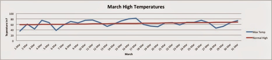
After a cold February and start of March, winter seemed like it would never end. I remember Raleigh peaking at 80 F a few times, and I was convinced that March would be another below normal month. At the end of March, I gathered the data. Here's the March climate for Raleigh:

Fig 1 shows the max daily temperature in blue and the normal high temperature in red. 

We see the maximum daily temperature oscillates around the normal high temperature. The normal high temperature is calculated by averaging the daily recorded value. Overall, the average high temperature for March was 62.7 F and the normal high temperature for March is 63.4 F. So, the average max temperature of March was slightly below average (0.7 F), but it's safe to say that it was "normal." 

Fig 2 shows the minimum daily temperature in blue and the normal low temperature in red. 

In figure 2 we see the daily low temperature linger around the normal low temperature. The average low temperature for March was 39.8 F and the normal low temperature for March is 39.9 F. Therefore, the average min temperature of March was barely below average (0.1 F). Again, the average min temperature is considered "normal." 

In conclusion, the month of March in Raleigh was a normal March (even though it felt cooler than normal). I was actually surprised to find that March was normal! 

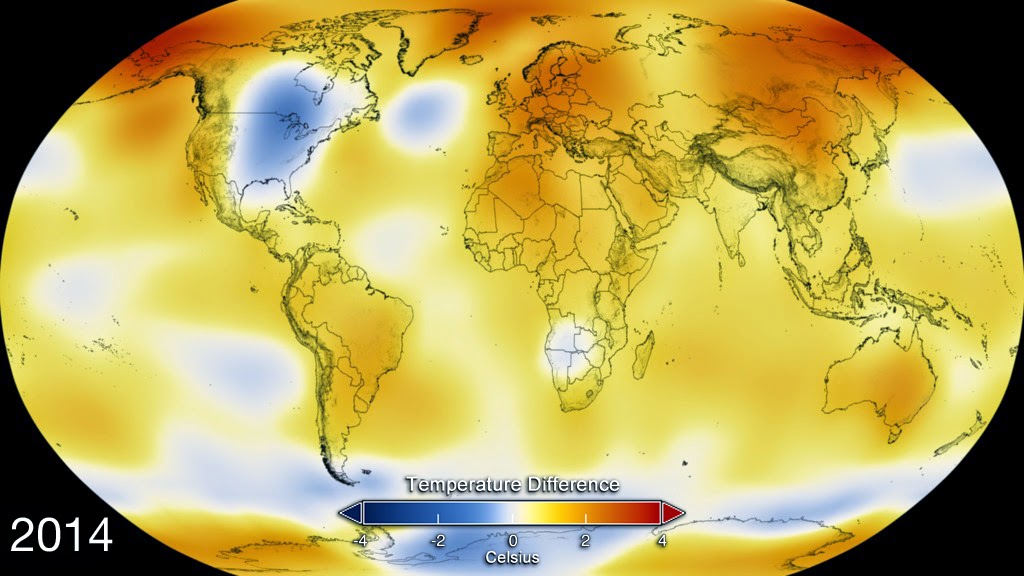
This is a great example of how our perceptions of the past are not great indicators of what actually happened. I hear variations of this phrase quite often: "It was so cold this month, Climate change is not happening!" I have two things to say on the matter. One, it's important to remember when looking at climate change or global warming, we're looking at the average temperatures for the entire globe. Take the year 2014 for example. Most of the Eastern United States experienced below average winters, while the rest of the globe experienced above average temperatures. In fact, the year 2014 was the warmest year on record. Let's take a look at the following picture from NASA


The yellow, orange, and red colors indicate areas of warming while blue indicates areas of cooling. This image is a great way to see the Earths deviations all together. So, yes, it was cooler than average in the Eastern United States, but when we incorporate observations from the rest of the planet, we see an above average year. 
Second, when particular areas experience cooler than average seasons or months, it does not indicate climate change is not occurring. When studying the complex climate we live in, we compare new data to that of data from hundreds and sometimes thousands of years ago. 

Climate Change is still a sensitive topic and it's very easy to say it's not happening because of a few anomalies. Therefore, it's prudent that correct information is published and explained to the general public, so we can avoid more confusion in the future. 


Tuesday, March 31, 2015

What Do Americans believe?

Recent studies have concluded that the nearly half of Americans believe that Anthropogenic Climate Change is occurring. Pew Research Center conducted a survey in 2014 and concluded about 61% of Americans believe there is solid evidence that the Earth is warming (Motel 30.3.15). Motel continues by stating that 48% of Americans believe it's a top concern. The top concerns were possible terrorists attacks and the nuclear plans of Iran and North Korea. As time passes, scientific evidence continues to indicate humans have influence the climate and scientific consensus continues to rise, too. A recent opinion survey showed that there's still a significant gap between the general public and scientists. The poll concluded that about 50% of the general public and 87% of scientists believe that climate change is mostly due to human activity.

Fig 1. Shows the percent of Americans that believe in Global warming and how many view it as a major threat. 


Honestly, I found these studies quite surprising. I feel like I spend a lot more time discussing how we know humans have influenced the climate than what we can do to fix the problem. However, I still remain quite optimistic after reading these studies. I think society is moving in the right direction. As scientific consensus increases, the public is sure to follow. Since more a more people understand that there is a problem, it is our job to introduce solutions.


Works Cited:
Motel, Seth. "Polls Show Most Americans Believe in Climate Change, but Give It Low Priority." Pew Research Center RSS. 23 Sept. 2014. Web. 1 Apr. 2015. <http://www.pewresearch.org/fact-tank/2014/09/23/most-americans-believe-in-climate-change-but-give-it-low-priority/>.

Saturday, March 28, 2015

Thursday, March 26, 2015

Climate Change Depiction in the Media

Here are some examples of how Climate Change is depicted in the media. No climate message is neutral and they display a frame of some sort. Most of the images of Climate Change are negative, so I think it's best to discuss them (as they are more likely to be viewed by the public). Studies have found that images displaying negativity do not cause of long-term behavior change. Therefore, I find it prudent to discuss them so they may be avoided in the future. 
The first image was produced by Greenpeace. It presents two images. The top represents "then" while the bottom represents "now." This image is meant to provoke an emotional response from the viewer. Hulme, Chap 7 referenced a figure from Shanahan (2007) that stated various Climate Change frames. I would classify this image as a "catastrophe frame," because the melting glacier is meant to convince the audience that the Earth is indeed warming. The glacier melting represents the potential disasters mankind may face due to anthropogenic climate change. The catastrophe frame is meant from those who are already concerned about the future of the planet. I have some issues with this image, the first being the validity of the image. These images could have been taken during different seasons; however, there is no way to verify. Also, while this image may induce immediate worry from the audience, I do not believe it would cause a behavior change. Typically, images of this sort disengage the viewer. O'Neill et al. 2013 found that climate impact images were less efficacious, which is not the desired outcome of the Climate Change campaign. The audience has a difficult time connecting the image of the melting glacier to their personal life. Not to mention, the image gives to solution to the problem, which may cause the audience to feel helpless. In conclusion, I’ve seen this approach done frequently. I do not believe it has made much of an impact in the past. Therefore, I believe it is best to avoid images such as these in the future. Especially since most of the American public believes Climate change is occurring, but they place it low amongst their priorities.


The second image depicts a well-dressed man representing the “industrialized polluting nations” destroying the developing countries with Climate Change. The intended audience is for those who care about those in the developing countries. The frame used in this cartoon is the industrialized polluting nations are solely responsible for destroying the developing countries. The audience is assumed to distrust politicians and possess sympathy for the developing countries. While I understand the cartoon is meant to be comical, I do not think it will cause anyone to change his or her opinion. This cartoon is meant for those who already share similar opinions. To be frank, it may provoke frustration amongst the audience who oppose Climate Change because the artist portrays the polluting nations in a negative manner. I personally do not like this image because all it does is places blame. Cartoons, such as these, are seen as “liberal alarmists” ones and further divides the nation into skeptics and alarmists (Nisbet 2000). If we are going to solve this problem, we cannot be divided.